Vix Vizion
Company website including products, solutions and case studies for customers and main users.

Role
Website Designer, UI Designer
Project Overview
Vix Vizion is a leading facial recognition software used in more than 500 venues around the world. I used Wix to create Vix Vizion website. Currently, it is undergoing a few updates so some pages may have a different UI.
Role
Website Designer, UI Designer
Why was a redesign needed?
-
First Impressions Matter: An outdated website design can create a negative first impression. Users often associate the look and feel of a website with the professionalism and relevance of the business. A modern and visually appealing design can enhance credibility.
-
Improved User Experience (UX): If the current website is not user-friendly, navigation is confusing, or the layout is not optimized for various devices, a redesign can improve the overall user experience. A seamless and intuitive design can keep visitors engaged and encourage them to explore the site further.
-
Mobile Traffic is Crucial: With the increasing use of smartphones and tablets, having a website that is responsive and mobile-friendly is essential. If the current website is not optimized for various screen sizes, it may result in a poor user experience for mobile visitors, leading to high bounce rates.
The Redesign
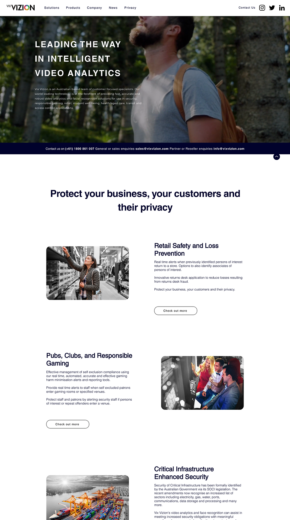
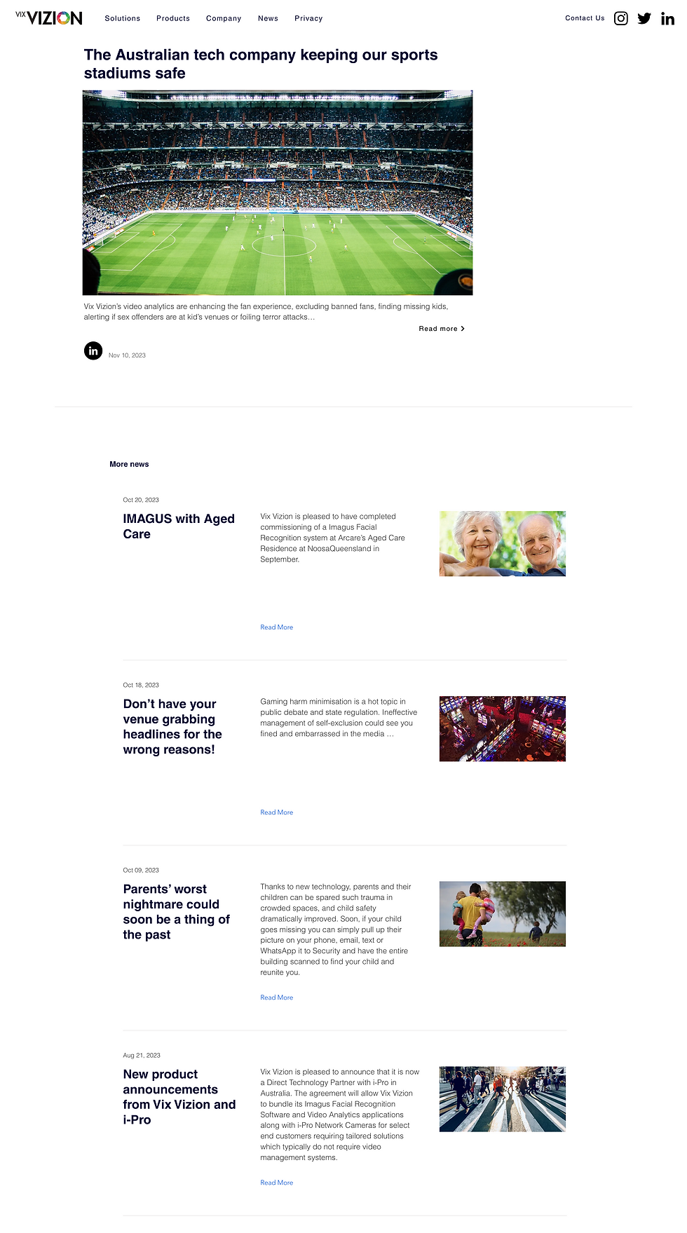
Below are images of a comparison of key pages on the website. Main changes include improved layout of the content as well as an up to date design trend.


Before
After


The Design Process
1. Content Audit
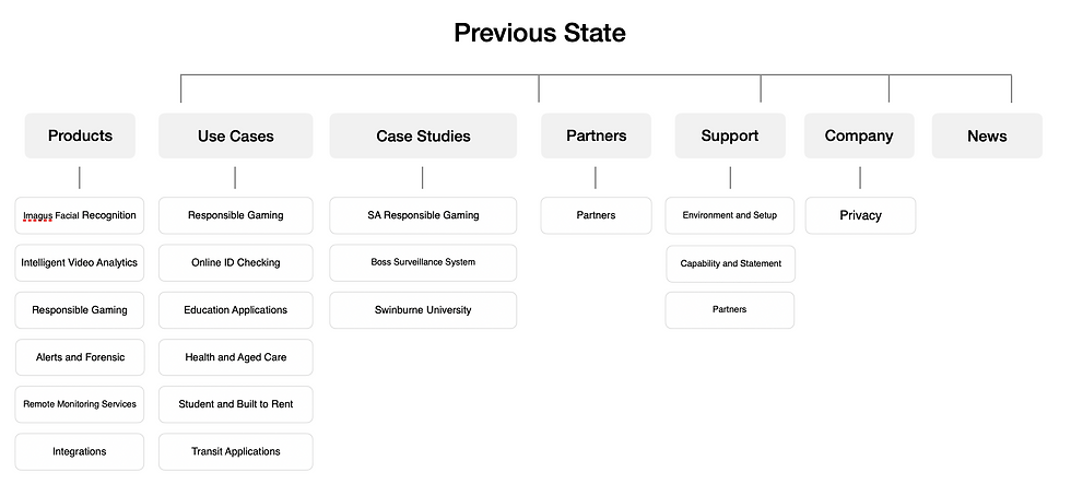
Previous State
I initiated the project by structuring the current information layout of the website. Working collaboratively with the team, we rearranged the information on each page to look more user friendly and intuitive. The pages of the website are highlighted in purple, and underneath, we outlined the corresponding sections. The primary goal is to ensure that users can quickly find the information they need in a straightforward manner once they visit the site.
New State
After analysing the website, it would benefit it to restructure the menu items. Filled or outlined in pink are new and rearranged items. I decided to move these boxes to navigate users to items easily and clearly.
I found that users had difficulty in accessing Vix Vizion's products and services. Some items were allocated incorrectly so user could not find the right information. I reallocated all items in right place; Products are in 'Products', Solutions/ Use Cases/ Case studies are in 'Solutions'.

Results/ Challenges
Increased conversion rates by 125%
Increased a returning rate by 25%
Increased avg. session duration by 10%
Building the Vix Vizion website was an opportunity to apply UX/UI principles in a real-world setting. I focused on creating a seamless user journey and dedicated significant time to the Products and Solutions categories. These sections are crucial for both our business and customers, as most visitors go directly to them to understand our products and case studies.
I faced a few challenges as well. Firstly, there were several limitations regarding sensitive information (such as our customers and testimonials) due to potential concerns about facial recognition and its public perception. Many of our customers preferred not to disclose their brand names or testimonials on our website. While I understood their concerns, user reviews would play a crucial role in building trust and credibility.
Secondly, Wix presented technical challenges, particularly with responsive design. While the website works well on both laptops and mobile devices, resizing the browser window on a laptop caused responsiveness issues. This is something that needs to be addressed soon.
2. Laying Out The Content
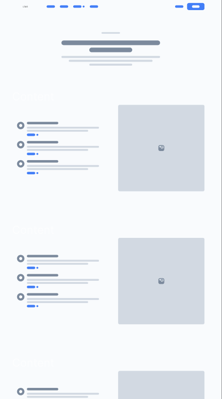
After identifying content structure, I translated it into a low-fidelity prototype. This prototype serves as a skeletal representation, focusing on layout and functionality without detailed design elements. It allows stakeholders to visualize the overall user flow and interaction points. Through this early-stage prototype, I aimed to quickly test and iterate on the fundamental structure, ensuring a user-centric design before investing in high-fidelity details. This approach enabled me to gather valuable feedback efficiently, promoting a more seamless and intuitive user experience in the final design.


3. Final Look
Here are final results of the updated website. It may be different to the low fidelity prototype, but overall structure and layout is the same.